The challenge
HostGator is a platform that attracts thousands of visitors on a daily basis. They envisioned giving a cohesive purchase experience to their audience and helping them make more informed decisions. The first step towards achieving this was to implement UX driven strategies across their website.
This vision, however, came with multiple challenges. Early conversations with the team made it clear that they worked with a very robust backend structure and how its architecture could not be completely altered. We had to drive innovation keeping these constraints in mind.
The next challenge was that our design had to appeal to three distinct audience sets: developers, tech experts, and entrepreneurs; every user visited the website with the same needs, but different depth of knowledge about the brand and its offerings.
Acknowledging these challenges, we started with the UX audit of the website.
- Identifying UX gaps and implementing accurate UX strategies
- Creating design solutions that can smartly enhance website conversions
- Making purchase decisions easier and creating leeway for upselling complementary products
Our approach
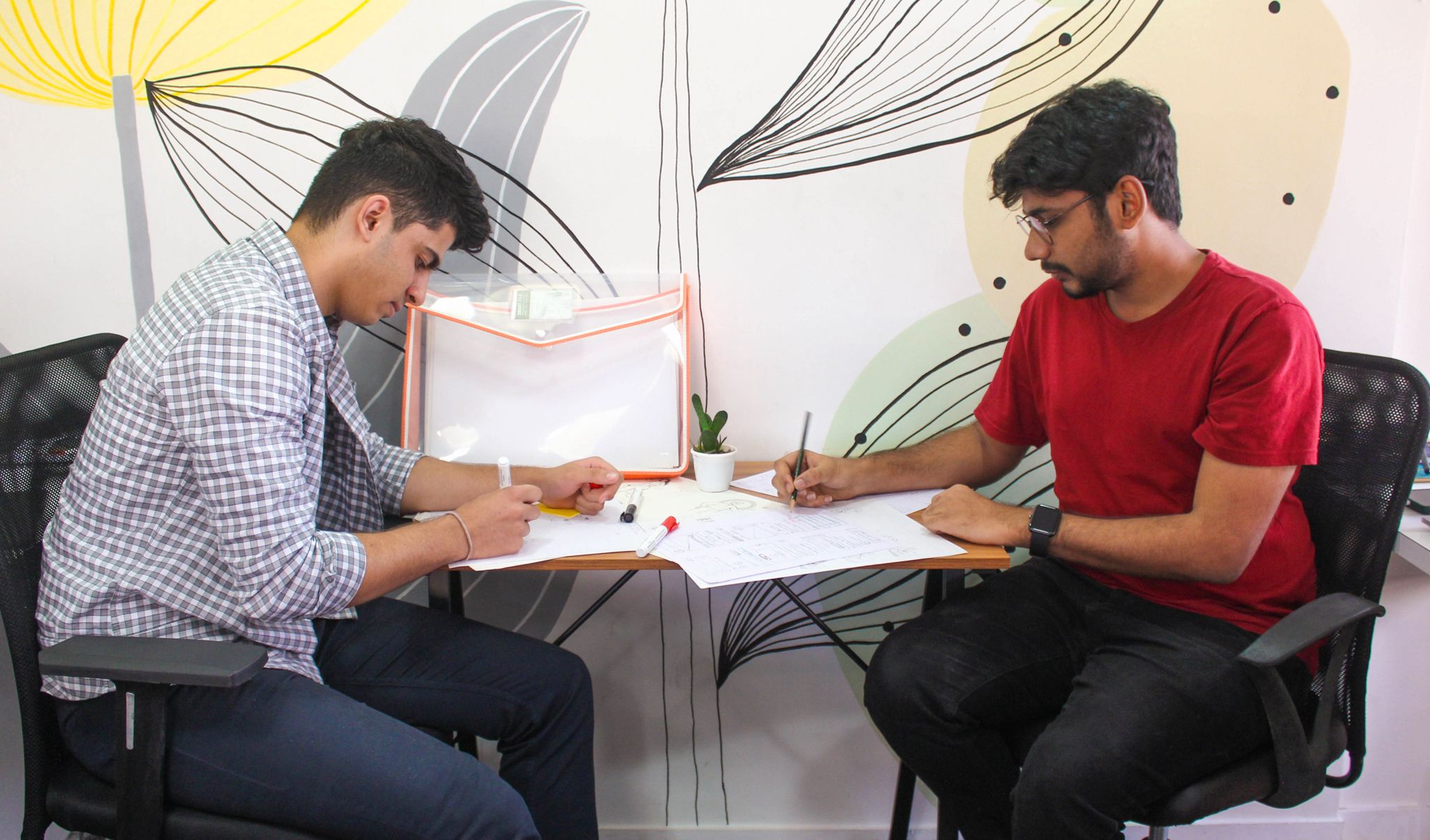
We worked very closely with the HostGator team to take several user interviews. The result was a treasure trove of detailed insights on people’s perceptions about using HostGator.
After gaining certain takeaways from the calls, we also carefully analysed the competition to understand behavioural patterns and points of differentiation.
The research provided us with multiple areas that we could work on to create a more seamless user experience. Soon, we understood the need to narrow our efforts towards certain problems, so we resorted to creating a Prioritisation Matrix to focus on the high-impact areas first.
- Market and user research
- Information architecture (IA)
- Competitor analysis
- User experience design (UX)
- Product innovation
- Wireframing and prototyping
- Usability testing
- UX-UI design
- Custom illustrations & icons
- Design system
- Design strategy
Intricate user journeys. Price discrepancies. Cross journey UX gaps that needed design solutions.
Cohesive design. Intuitive features. Encouraged trust and boosted conversions.
User goals and features
Developers and agencies
They are constantly looking for new solutions to fit the needs of their clients. They’re also the ones who always keep the price in mind. To aid their purchase decisions, we had to highlight how HostGator provided cost-effective yet efficient solutions.
Technology experts
Tech-savvy and well-informed, these users typically knew exactly what they needed. They spend less time and focus on only relevant, tech-oriented information. We had to ensure that relevant information was available at all times with the ease to connect to support teams instantly.
Business owners
Generally, non-technical people who spend more time on the platform to look for the right fit for their needs. A guided product journey matters more to them than just technical product information. We had to be extremely careful and always keep this persona in mind.


UX-UI Design
We kicked off the design process by starting to leverage all our insights. We started from the ground up, took into consideration every user concern priority-wise, and designed to make the experiences better there.
Post that, we began solving for making product comparisons easier and more mobile-friendly. Our focus was also on creating a more seamless cart journey and addressing areas that led to price shock amongst the consumers. While at it, we saw that important real estate could be utilised to showcase more user-centric items.
For building the user interface, we had to piggyback on the current brand guidelines and augment them for a distinguished experience that boosted brand recall.
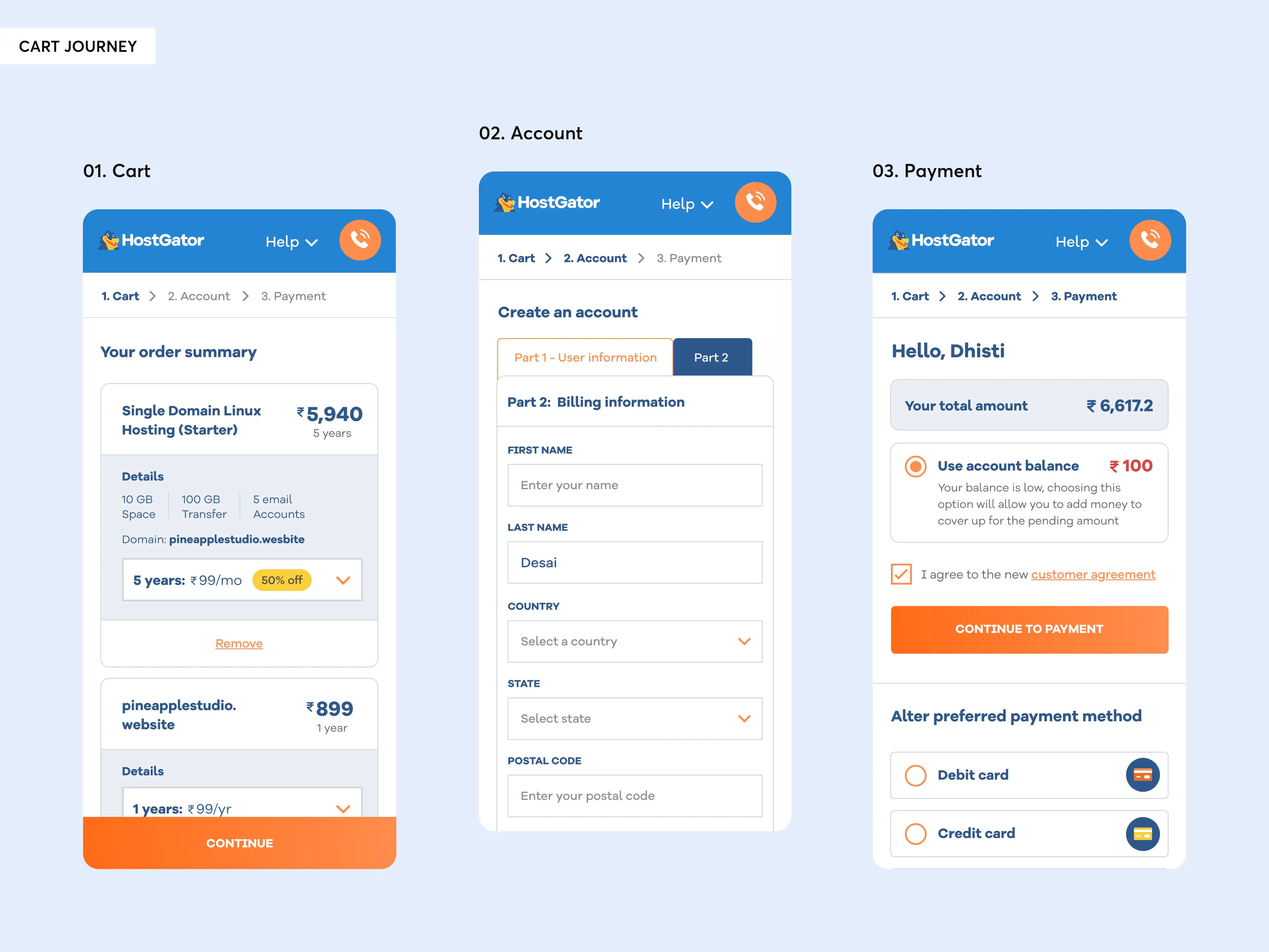
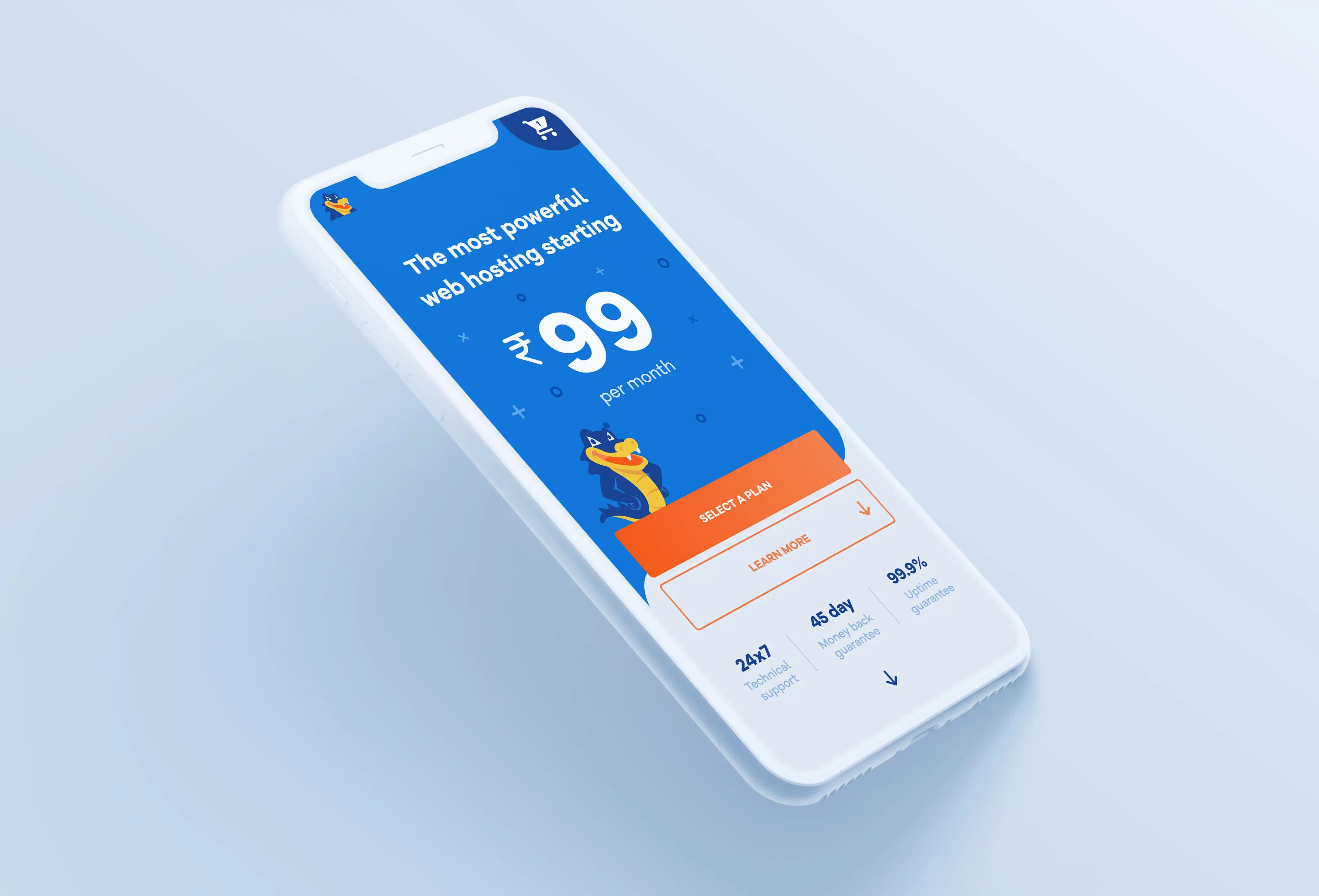
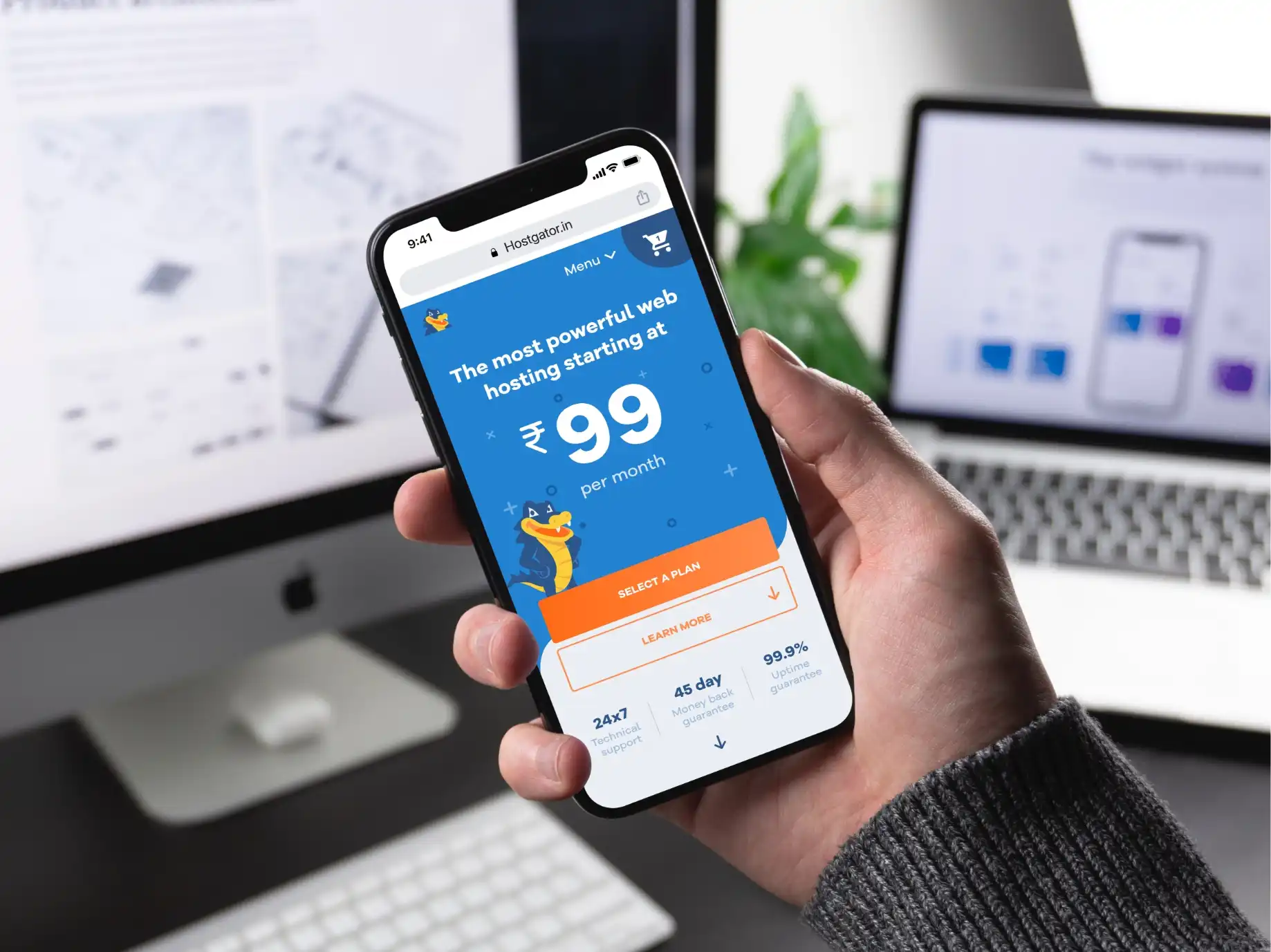
A mobile responsive website served as the first source of impression for most of HostGator’s users and it was important to capitalise on it. Our goal was to unify 3 elements viz. UX writing, user experience and visual design. We added tailor-made content and prompts to make user journeys smoother. Another important part was to optimise the way products could be compared on smaller screens.
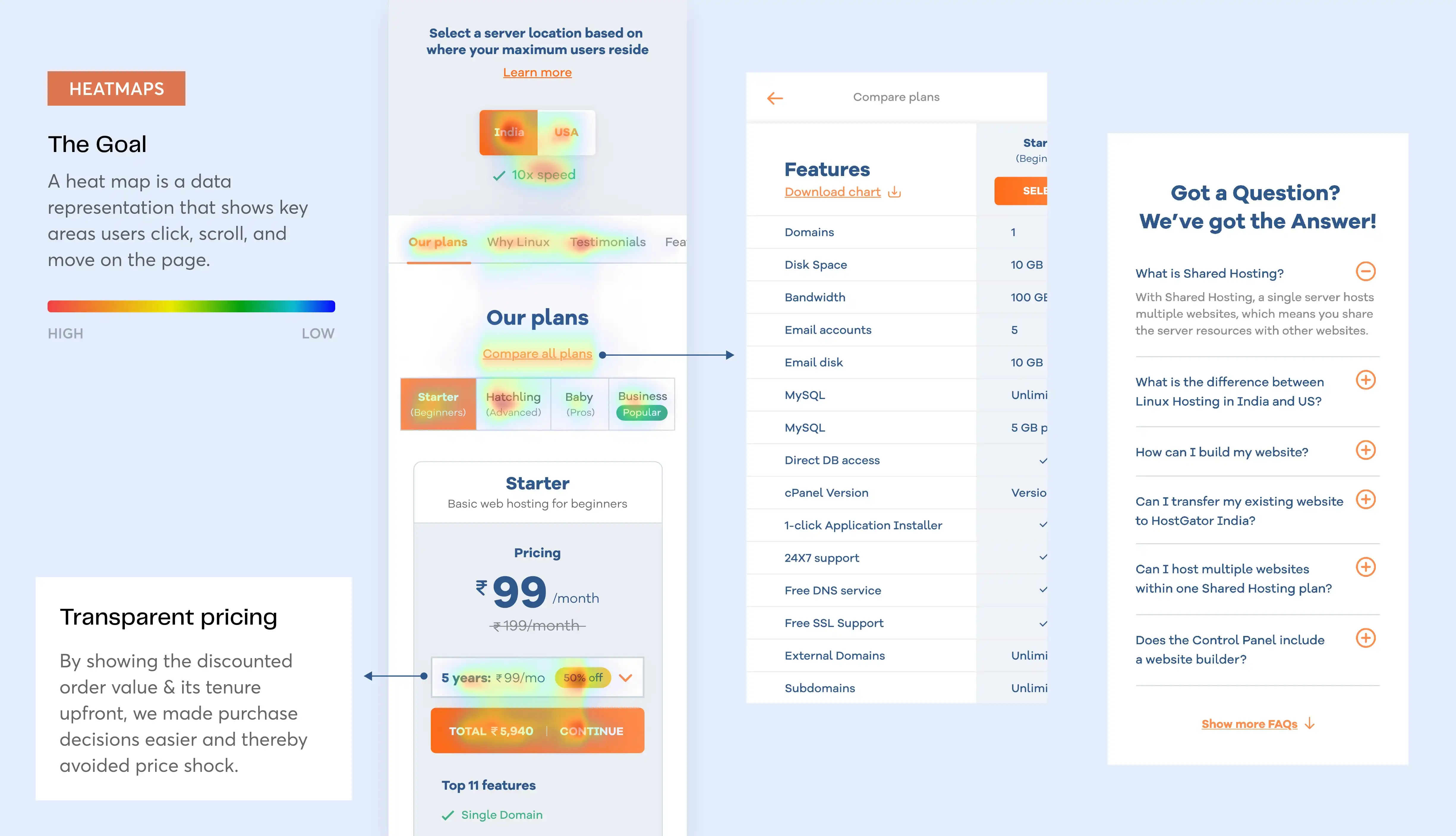
We wanted to build trust among consumers before compelling them to buy products and solutions. Using the data from heatmaps, we recognized certain areas that the customers would spend time on and made them as transparent as possible. This solved the concerns related to price shock and encouraged confidence amongst customers.
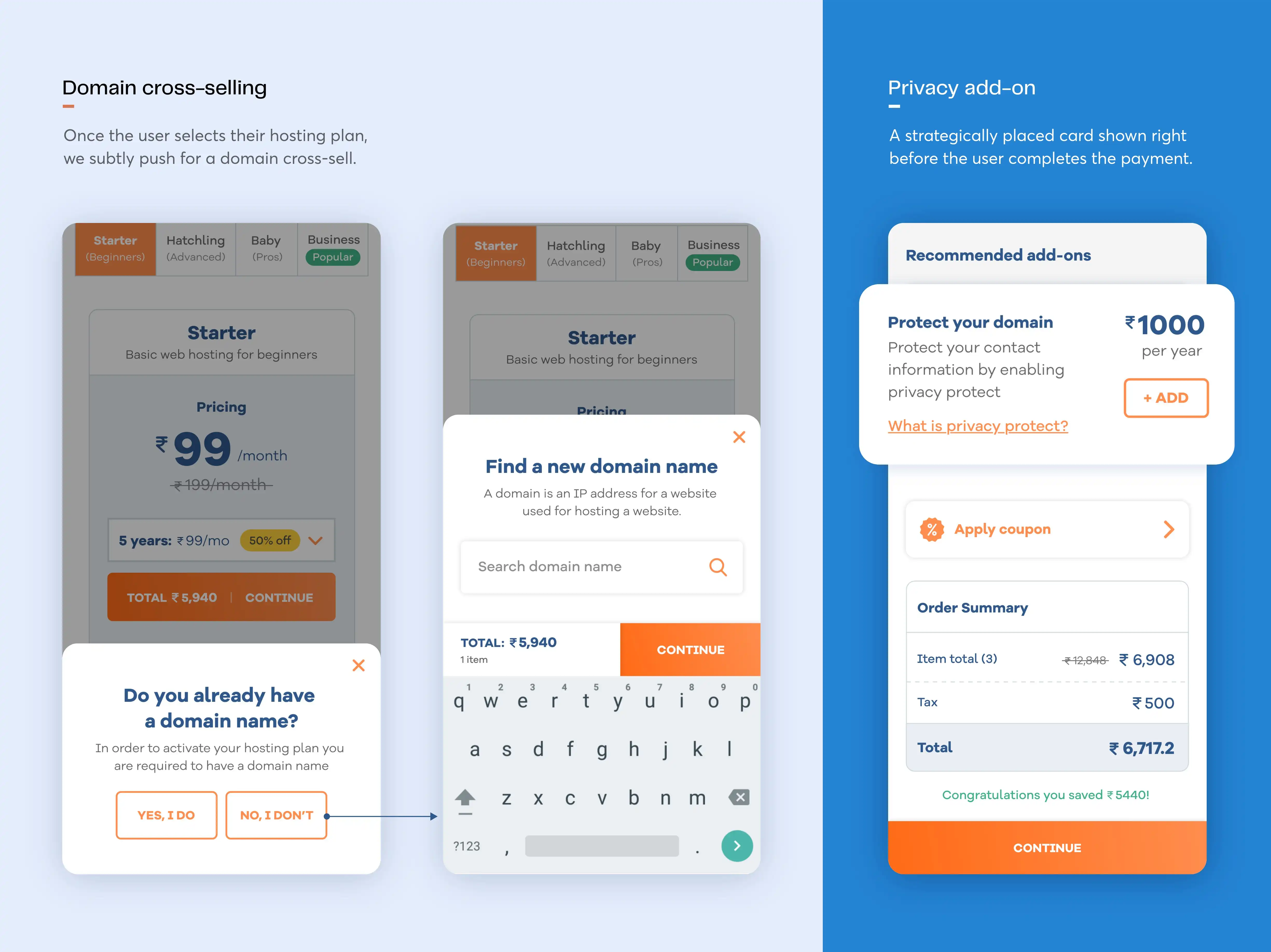
Boosting revenue was a key goal that we had in mind for HostGator’s reimagined mobile design. Throughout the design, we looked for adding cross-selling and upselling opportunities, which translated to important add-ons, domain purchases etc.
