The challenge
India is home to the world’s biggest under-24 population — yet, the proportion of young borrowers in the country is low. As cited by TransUnion CIBIL, out of the 609 million Indians below the age of 24 years, 147 million are eligible to apply for credit. But only 9 million people are “credit active” or have availed some form of credit.
Credit card is a debt facility which makes a few people apprehensive about availing it, while a few others fear going overboard with their expenses, owing to minimal financial literacy. To build a successful product, we had to understand their behaviour in context to their daily lives, money, and technology.
The challenge increased further on finding different ways to motivate and engage people. We had to keep in mind that Gen Z differs vastly from millennials when it comes to motivation and engagement triggers. We had to consider these factors throughout our approach.
We had to constantly think of not just new ways of innovation but also methods to stand out and retain each user, amidst the red-sea of new age platforms.
- Building meaningful engagement and retention through product innovation
- Helping the Gen Z be credit active and spend wisely.
- Designing a product that understands the paradigms the GenZ revolves around

Our approach
The goal was simple. We wanted to create an impactful platform that was driven by data and product intelligence. We started the process by understanding the financial ecosystem and visualising how user expectations could be fulfilled within the bounds of the business model.
Next, we dove into research, to understand the various personas and lifestyles that we had to cater to. Being an agency with young executors, we curated a team for this project that reflected these lifestyles and was able to offer unique perspectives into the lives of the target audience.
Intense discussions and trendspotting led us to adopting personalization that was driven by cashbacks, community, and comfort as the core of our solution.
- Market and user research
- Information architecture
- Structuring true insights
- Product innovation and strategy
- User experience design (UX)
- Wireframing
- Usability testing
- UX-UI design
- Custom illustrations & icons
- 3D design
Credit is risky. Not tailored for Gen Z. Barrier to getting credit access.
Built trust. Hyper-personalisation. Created a fresh perception towards credit.
User goals and features
High-school & undergraduate students
Digital natives, these users are mostly spending in cash but seek financial independence. They are looking for ways to impress their peers and be the cool one in the group. With our solution, the aim was to give them lucrative incentives and instil good financial habits.
First jobbers
This persona has recently gained independence and taken money matters in their own hands. There is fear of debt that makes them averse to using credit cards. It was essential to impart knowledge that helps them spend wisely and reap the benefits of the card.
Growth seekers
This persona is financially literate and understand the benefits of availing credit. To appeal to these users, it was essential to distinguish the EZ credit card and its offerings from the competition.


UX-UI Design
Owing to our experience in the Fintech vertical, we understand that finances go hand-in-hand with trust. We built two touch points: a micro-site and an app, that boosted confidence and engagement, which led to trust. The micro-site was built to highlight the expansiveness of the app, while the app was to bolster engagement, motivation, and retention.
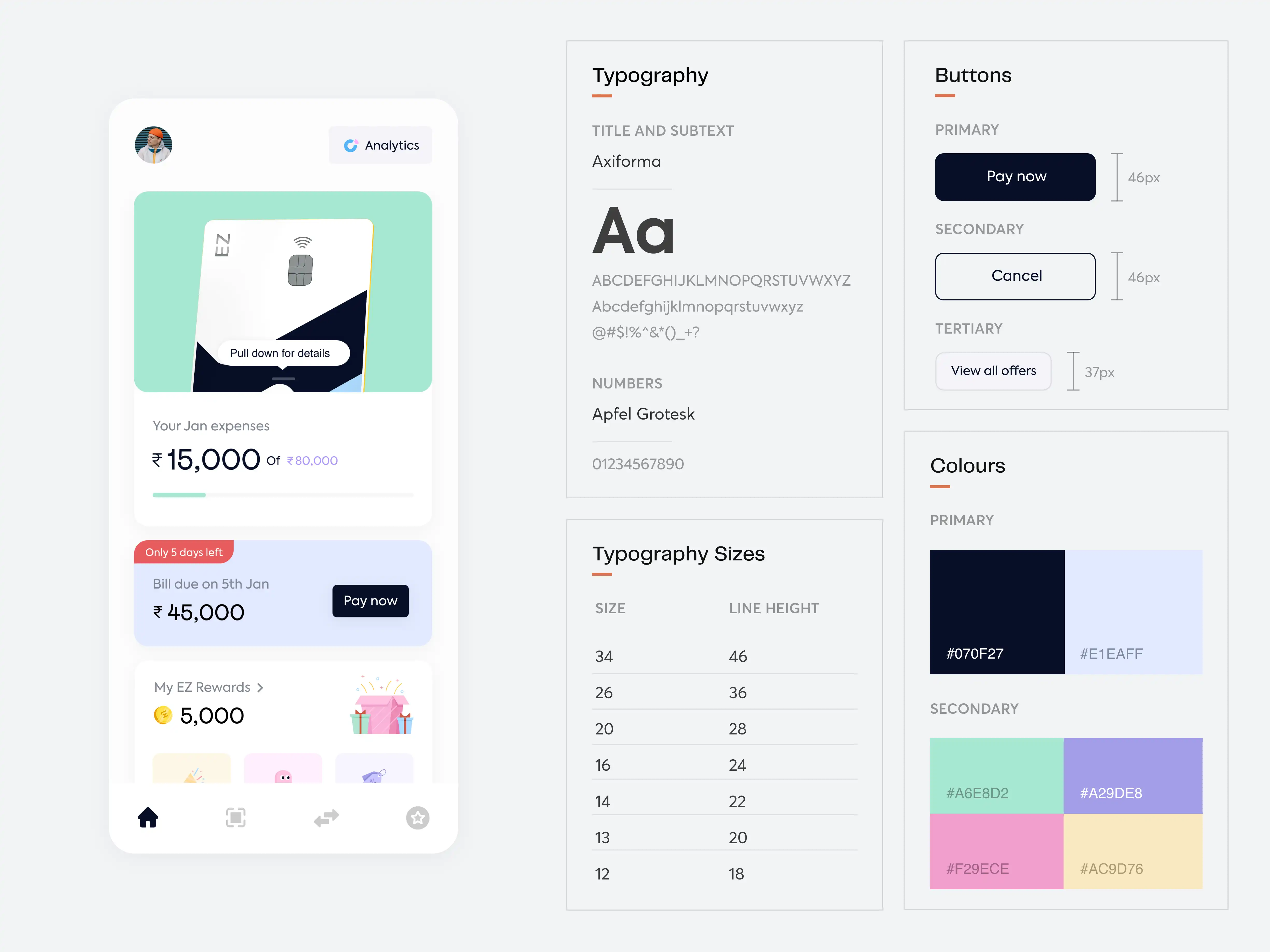
The colour palate was chosen to make it fun and exciting for the Gen Z audience, enticing them to use the app more. Custom cards, illustrations, and 3D art was used to further connect with the younger generation. We deliberately went ahead with a sans serif typeface that could make the product scalable as well as convey its prowess with clarity.
The UX writing was planned carefully, starting with the development of a distinct voice. We personified the brand as someone who’s reliable, spontaneous, fun, and loves indulging in premium experiences. This was translated in our content through a lingo that resonated with Gen Z.
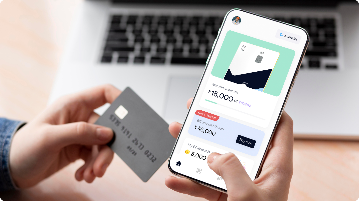
Gen Z is a generation that lives and breathes digital. To connect with them and further enable their financial freedom, we enabled UPI payments on credit. This, coupled with the benefit of 0% EMI on medical bills gave users the ability to take care of themselves and their loved ones, no matter the situation.
![3. [New] EZ First Showcase.png](https://admin.pineapple.design//uploads/3_New_EZ_First_Showcase_9fbc1782d1.png)
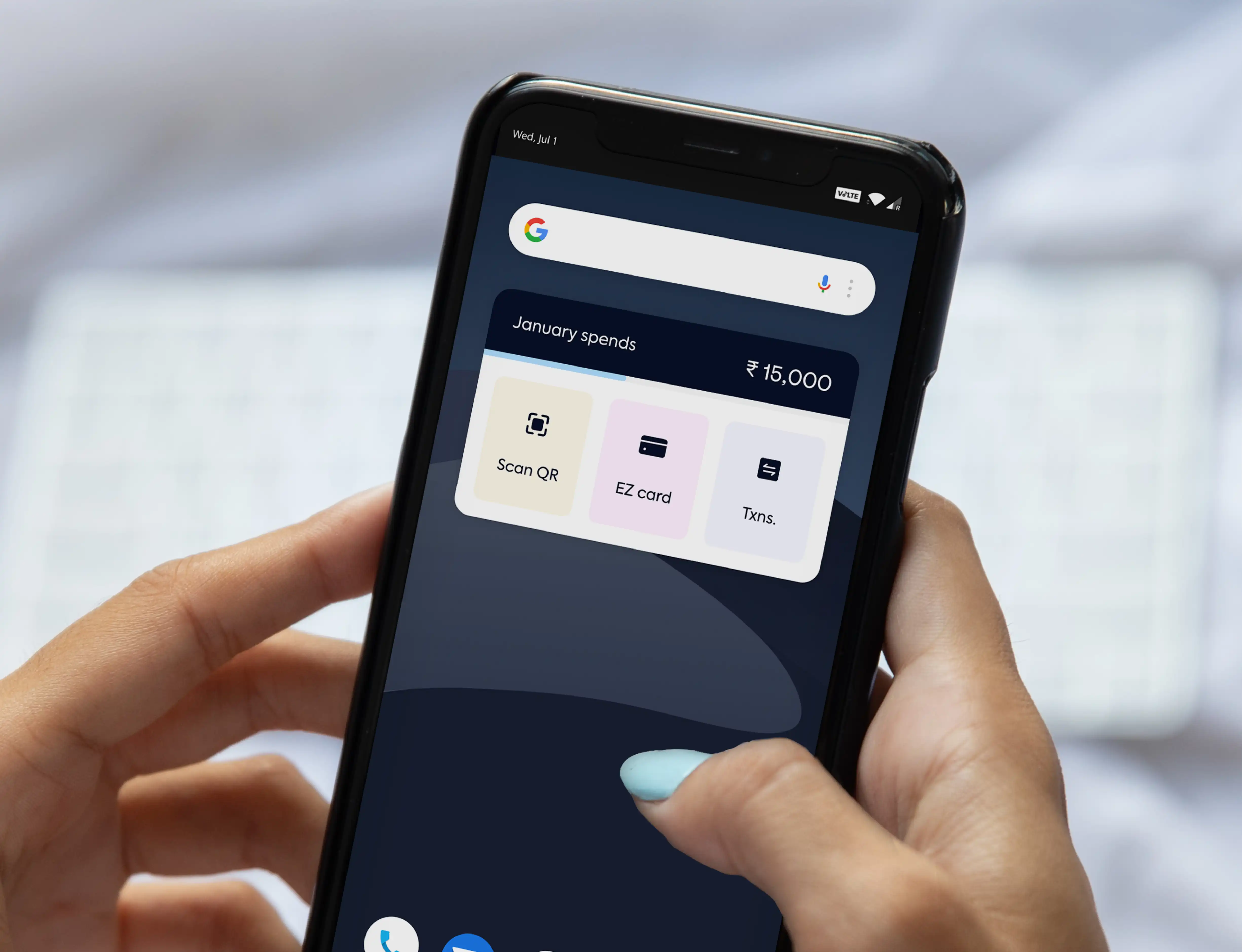
We noticed that the new-age generation craved financial independence but felt lost. To aid them, we created a platform that allows them to get a detailed insight into their expenditure on a monthly & weekly basis. They can also set limits on how much they want to spend and will get notified in case of overspending. This further inculcates the habit of saving and spending money wisely.

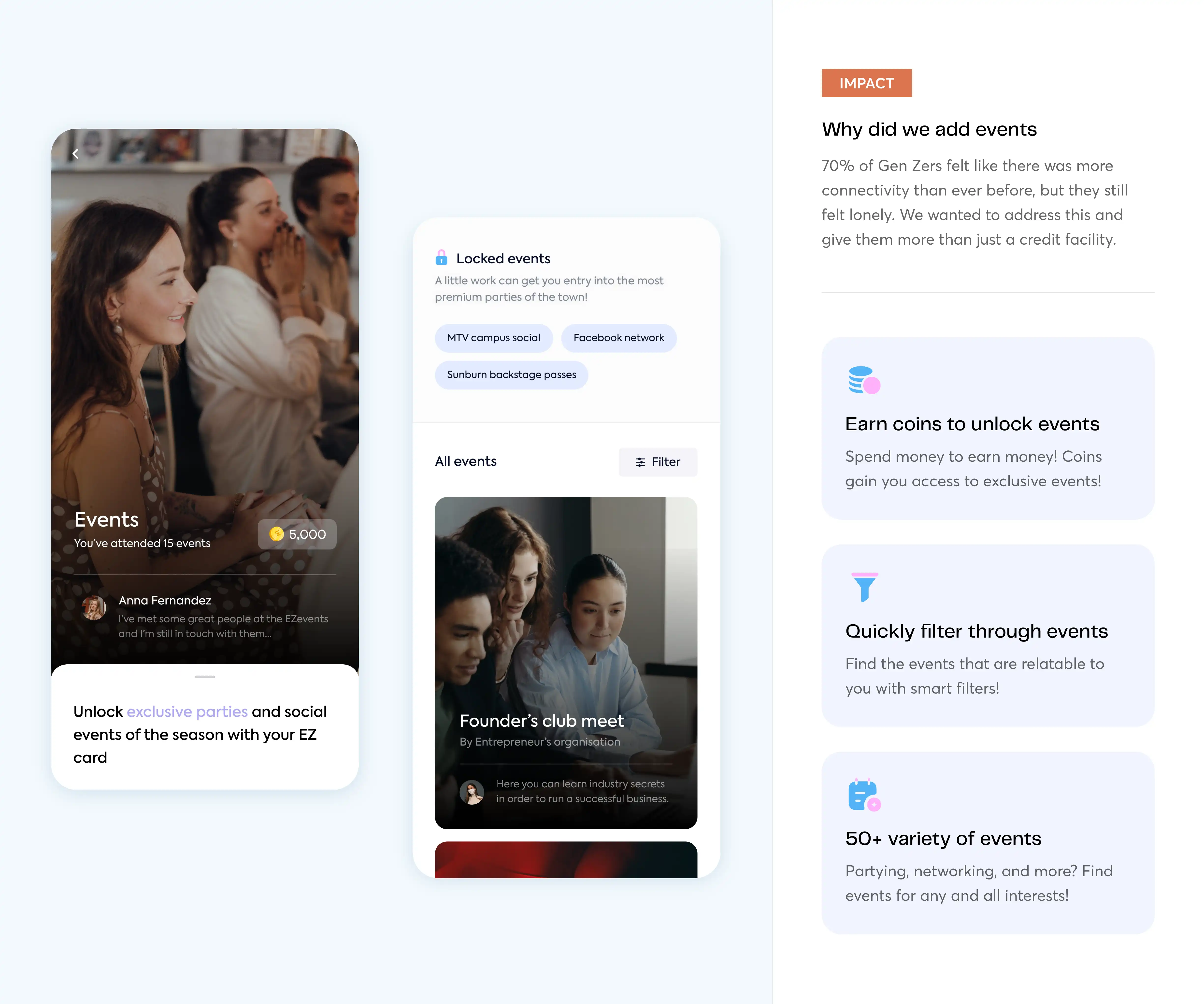
Everyone wants to belong somewhere and Gen Z is no different. Our focus was to ensure that the app would help today's youth to be a part of and grow with a community. How? We gave them access to special events and parties. These were tailored to their preferences, so they could decide whether they wanted to attend them to network or simply unwind.
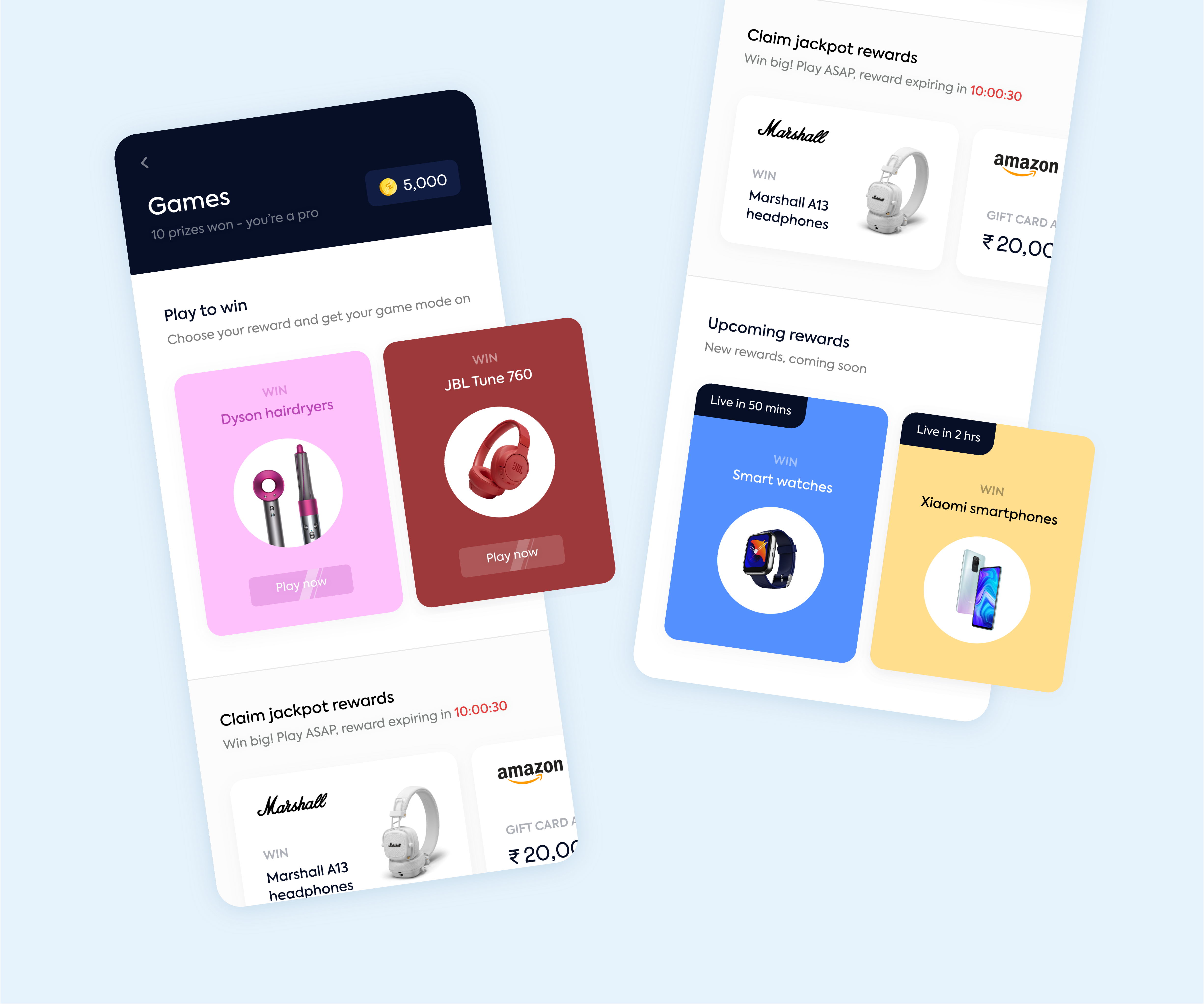
Gen Z is hard to retain in most services, and so, we decided to make user engagement a core aspect of this app. We gamified the system as a way to keep our young audience more excited about using credit. The more purchases you make, the more rewards you get! There were also specific reward games, where you choose what you get. For example, a game where you can win an iPhone after you reach a certain number of points.
