The challenge
CitiusTech is championing next-gen innovation within the healthcare space. In this endeavour, the website was a critical piece and they needed someone to translate their vision through design. Pineapple was brought into the picture to design a website that enables meaningful communication and portrays them as the true leaders they are in the industry.
Our biggest challenge was to design effectively for an audience that comprises the highest levels of healthcare professionals, industry leaders and healthcare businesses globally. We are talking about major-league players and veterans here.
Another key responsibility we took was to balance a product-first approach in UX/UI designs while strategically thinking of building trust with their visitors.
- Building additional credibility amongst a reputed industry crowd.
- Balancing the UX UI designs using a product-first approach.
- Showcasing CitiusTech's industry wide expertise and impact through design.
Our approach
To amplify the experience of a user who lands on their website, we took the first step of conducting industry-wide research. This would help us understand the best practices, competition, and how CitiusTech can be positioned uniquely.
The research gradually unravelled some pain points which opened newer challenges for the teams to solve. Our team immediately noticed the immense potential the website redesign would unlock, as compared to its current one.
After multiple deliberations with key CitiusTech stakeholders, we narrowed down the key goals for the website which were, building trust, credibility, and engagement.
At this point, we knew that healthcare tech's long-standing stereotype of being text-heavy had to be done away with. So, we made sure to take a clean and minimal approach to meet our goals.
- Market research
- Competitor analysis
- Structuring true insights
- Design Strategy
- Insights discovery
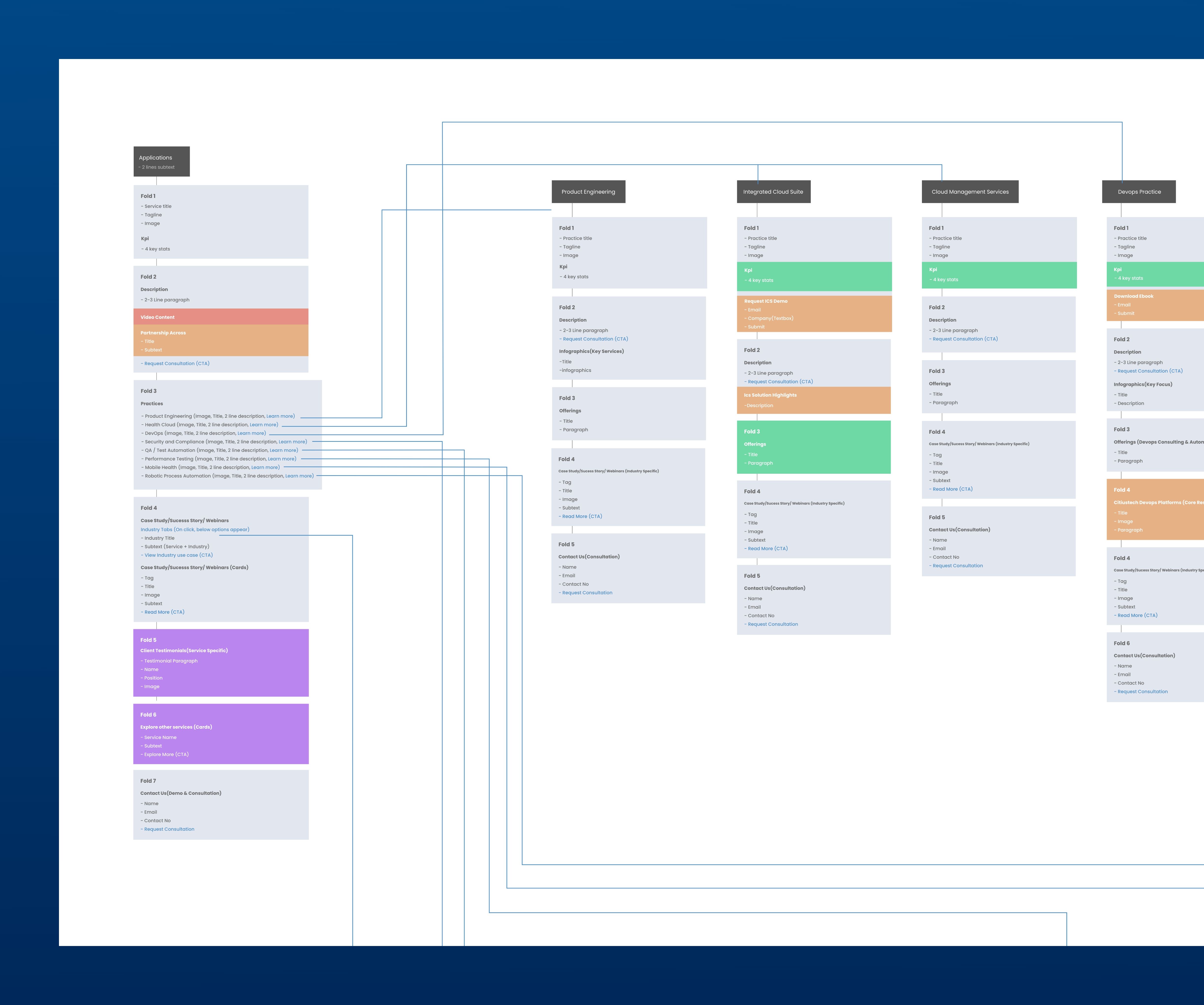
- Information architecture (IA)
- UX/UI Design
- Design system
- Motion Design
CitiusTech helped client partners scale exponentially, but the website did not bring out what they truly offered and communicated.
Evolving them to their modern, actual self and warrantying the highest levels of credibility through UX/UI design.
User goals and features
Industry veterans
Industry veterans have over 15-20 years of experience in the healthcare industry and are the ones who make major product and service decisions. We wanted these players to understand the positive impact created by Citiustech through and how their products would help them do that in their organization.
Healthcare institutions
Large healthcare institutions are constantly on the lookout for products that give them an edge. We showcased how CitiusTech solves for the constant requirements of healthcare institutions with the best-in-class technology.
Knowledge seekers
People look up to Citiustech for their expertise in the healthcare technology domain and want to constantly stay apprised on what’s happening. We knew that we needed to engage these seekers through a constant inflow of multiple content streams on their website.


UX UI Design
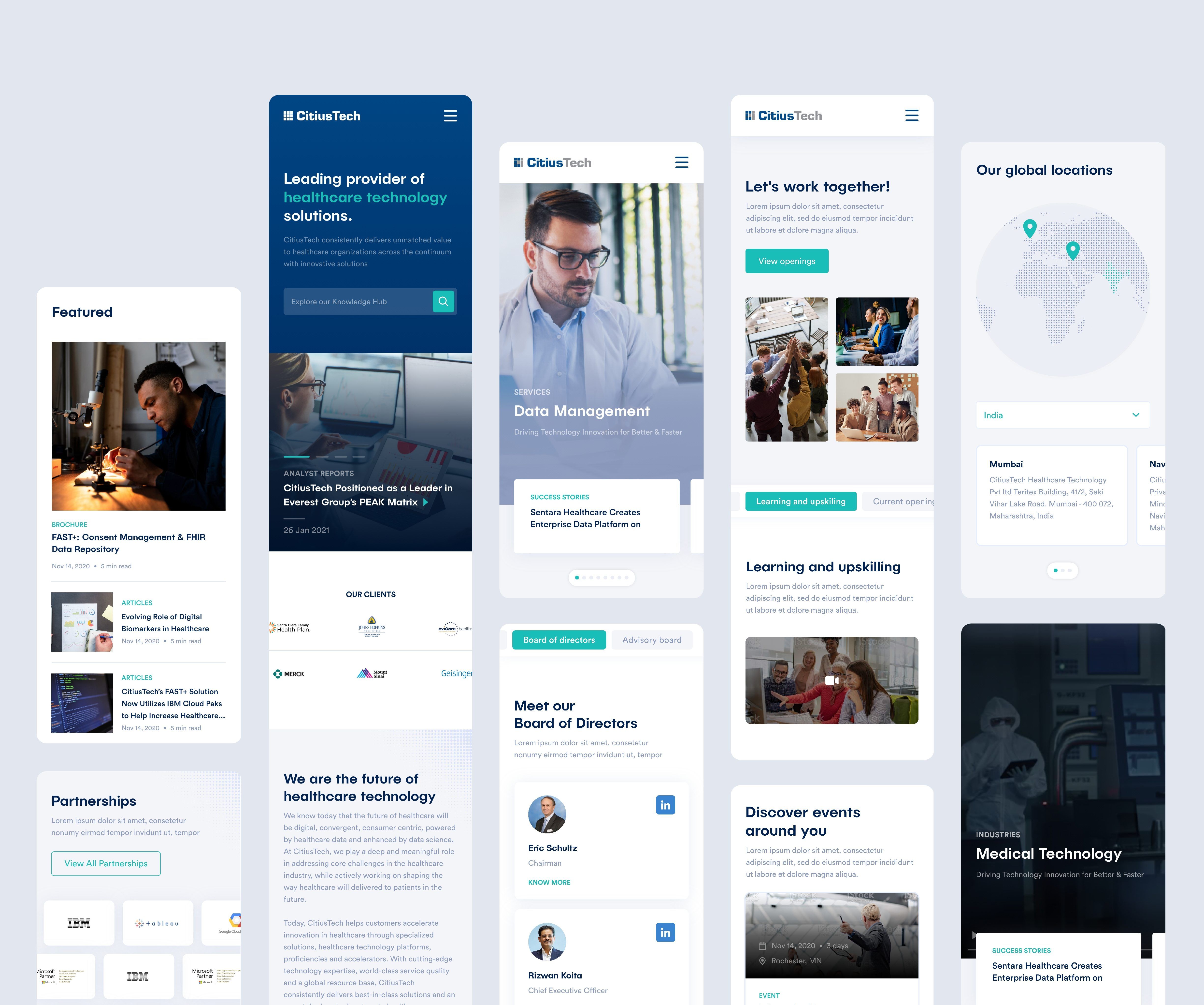
How does a UX design agency re-design an established resonance that CitiusTech has with its audience? We don't. We improvise. So we buckled up and improvised on the complete design outlook, including the typography and colour palette, without losing the essence of CitiusTech's core values.
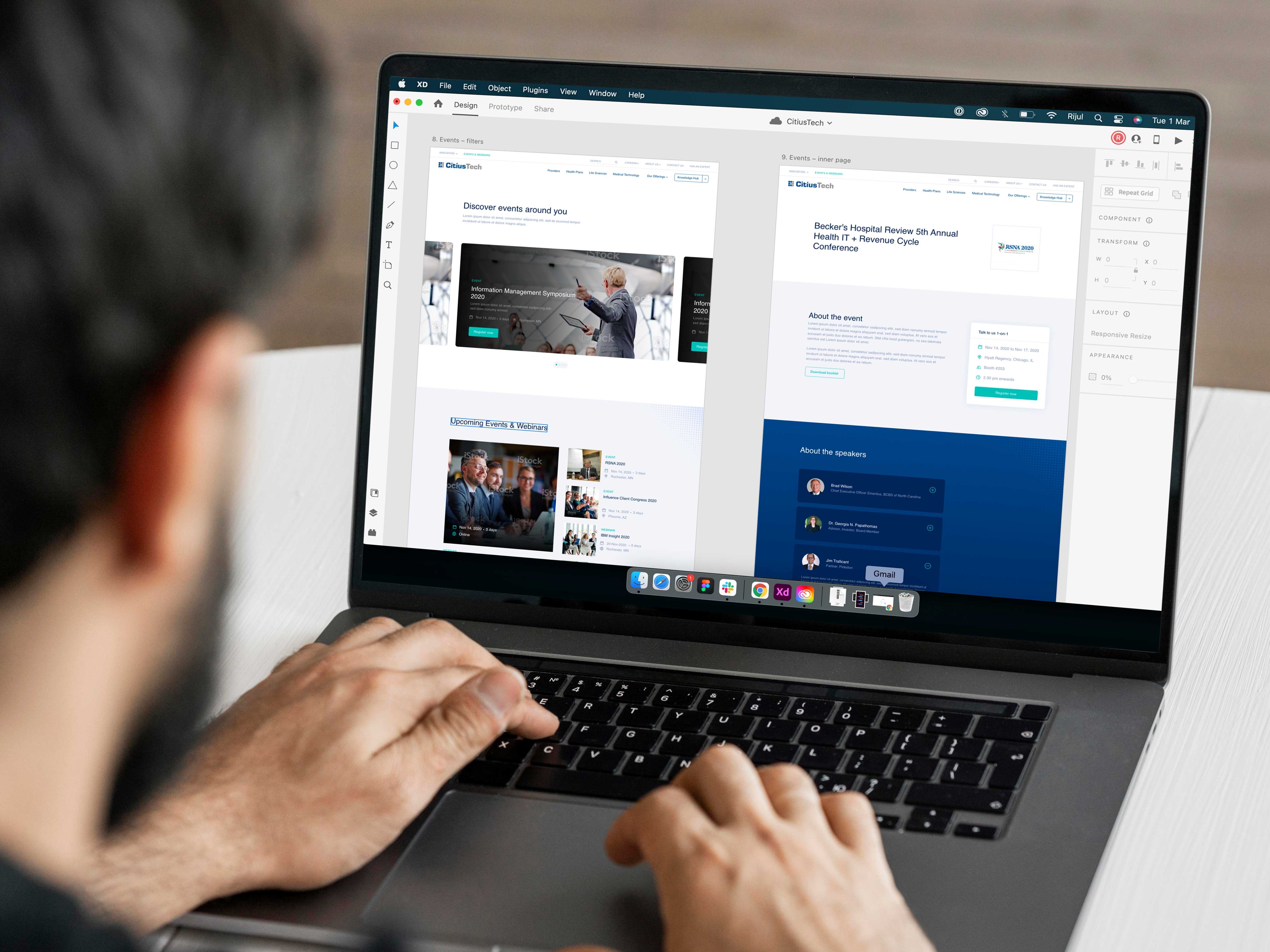
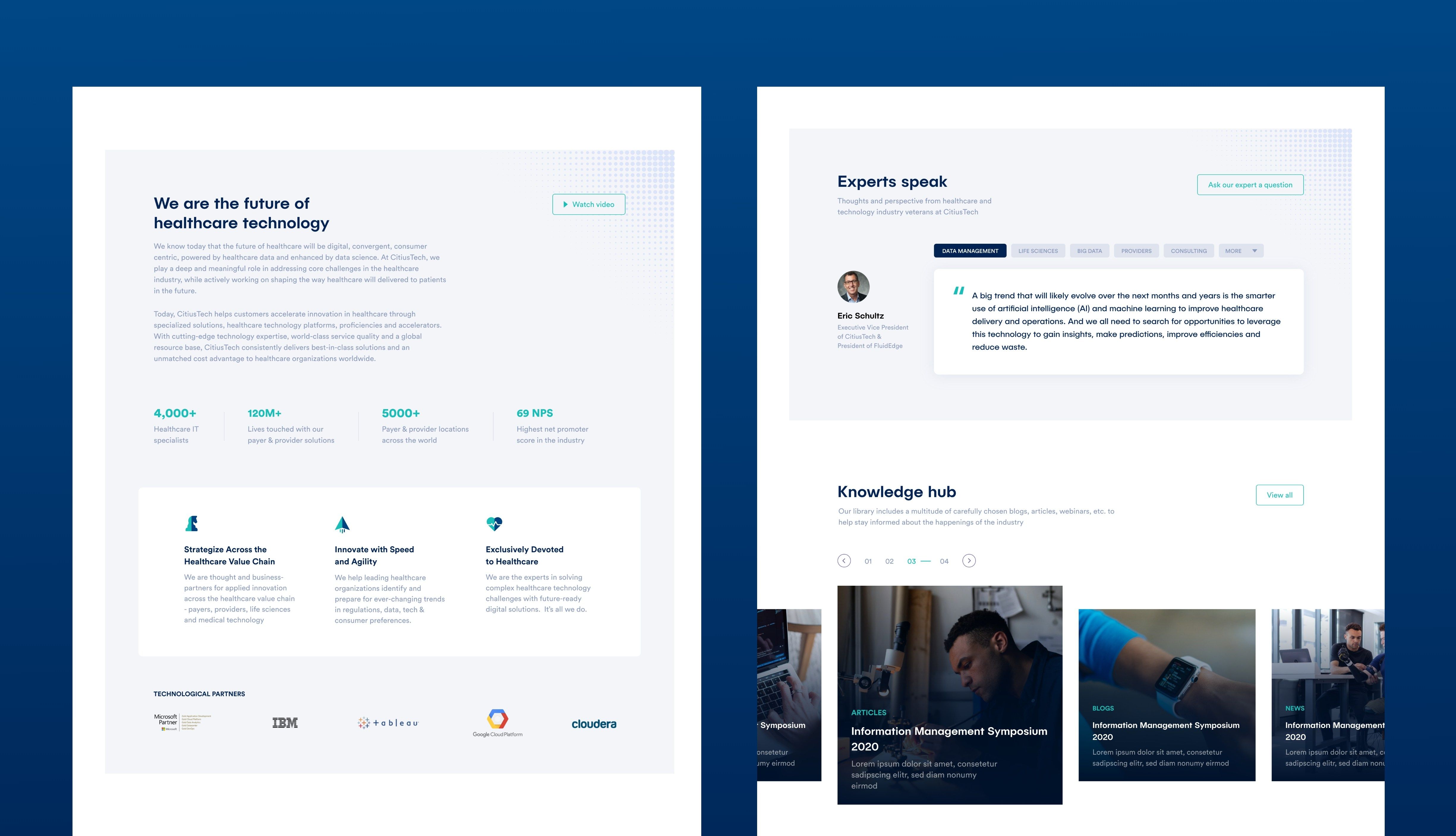
CitiusTech's impact can be traced internationally but the strength of their services and products had to be showcased strongly. We leveraged concrete visuals of top clients and insightful KPIs that showcased business impact and credibility.
The target audience being industry veterans, have limited time. They are firm believers of cutting to the chase. We ensured that the design 'be power-packed with case studies and demos to instantly showcase the true potential of their products and services.
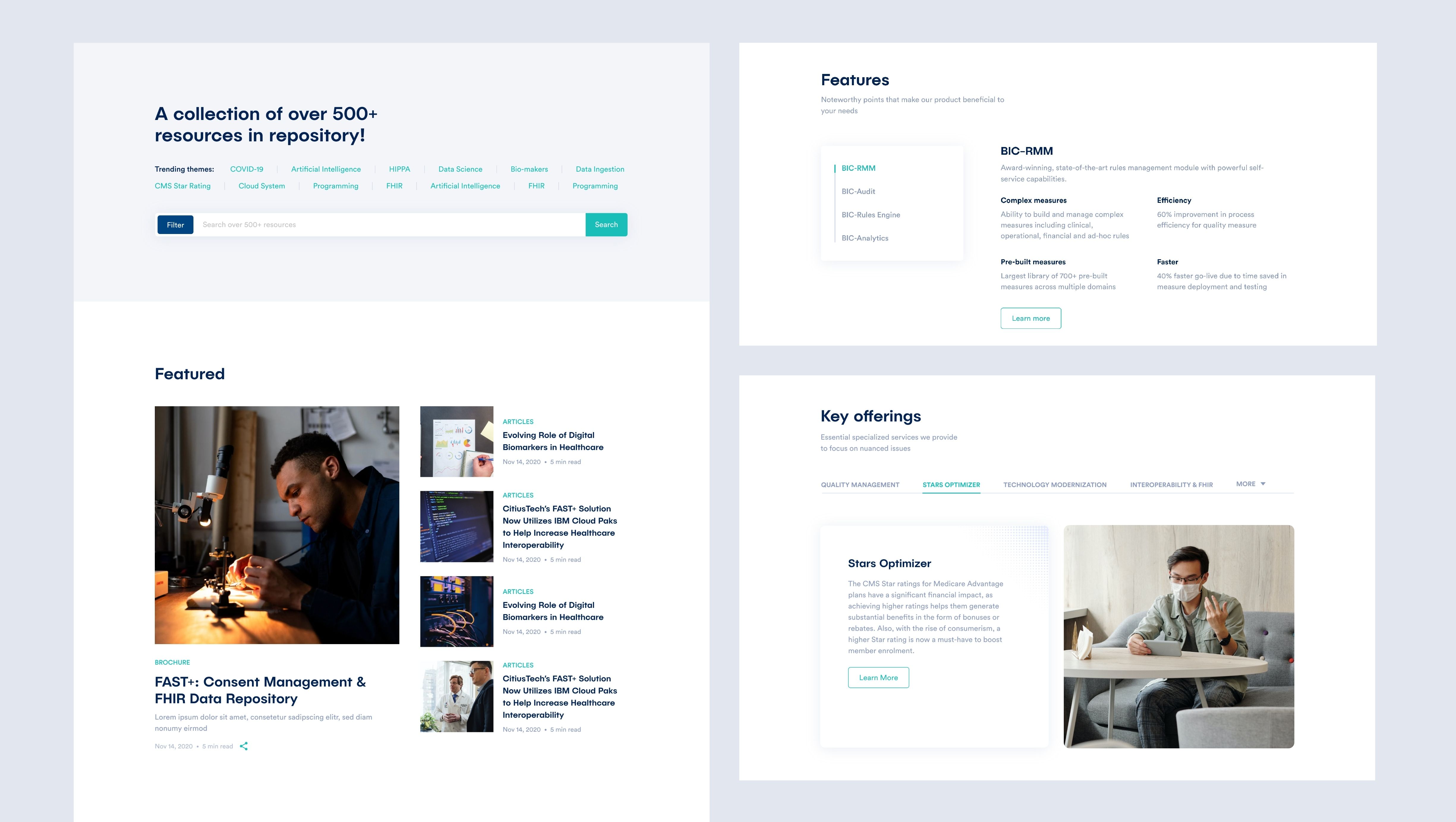
During our research, we identified a recurring UX problem in this industry - users often do not know which page they are on as they navigate the website. This problem was tackled by building a self-explanatory navigation system.
